
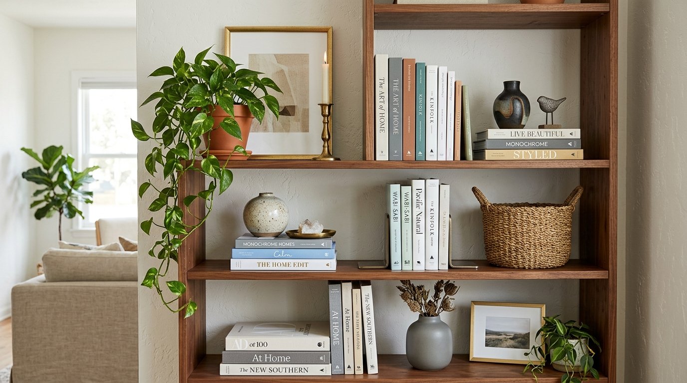
Shelf Styling Explained: The Rules Interior Designers Work From
An empty shelf is one of the harder surfaces in a home to fill well. It offers no obvious starting point, no rules printed on the side, and no forgiving corner to hide a mistake in. Learning to style a shelf like an interior designer is mostly a matter of learning what to look at, not what to buy.
Professional stylists rarely arrive with a van of new objects. They arrive with a method. Shape, height, spacing, and visual weight get sorted first, and the specific vase involved matters far less than where it sits.
The ten steps below run in the order a stylist would work through them, from an emptied shelf to a finished one. Anyone applying this in a compact home may also find these small home decorating ideas that make a big impact useful alongside it.
Start by Clearing Everything Off
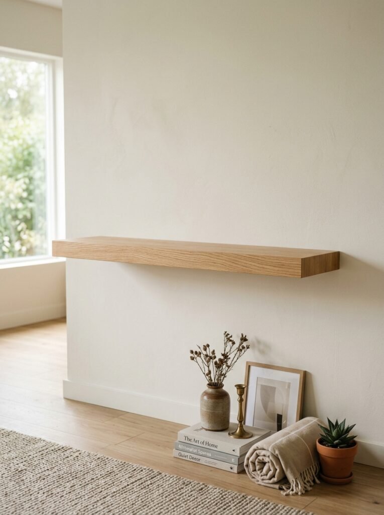
Editing a shelf in place almost never works, because the existing arrangement keeps steering the next decision. Taking everything down removes that anchor and turns the job into a fresh composition.
A photograph taken before the clear-out is worth the five seconds it costs. It provides a reference point later, when the new version looks different but not obviously better. Comparing the two images settles that question quickly.
The empty unit deserves a proper look while it is accessible. Adjustable shelf pins often sit at whatever spacing the previous owner chose, and moving one shelf up a notch can create room for a taller object. Dust the boards dry first, then wipe them, since a damp cloth on heavy dust smears rather than lifts.
Everything removed should land on the floor in front of the unit, sorted into three piles: staying, going elsewhere in the house, and going away entirely.
Gather a Mix of Objects
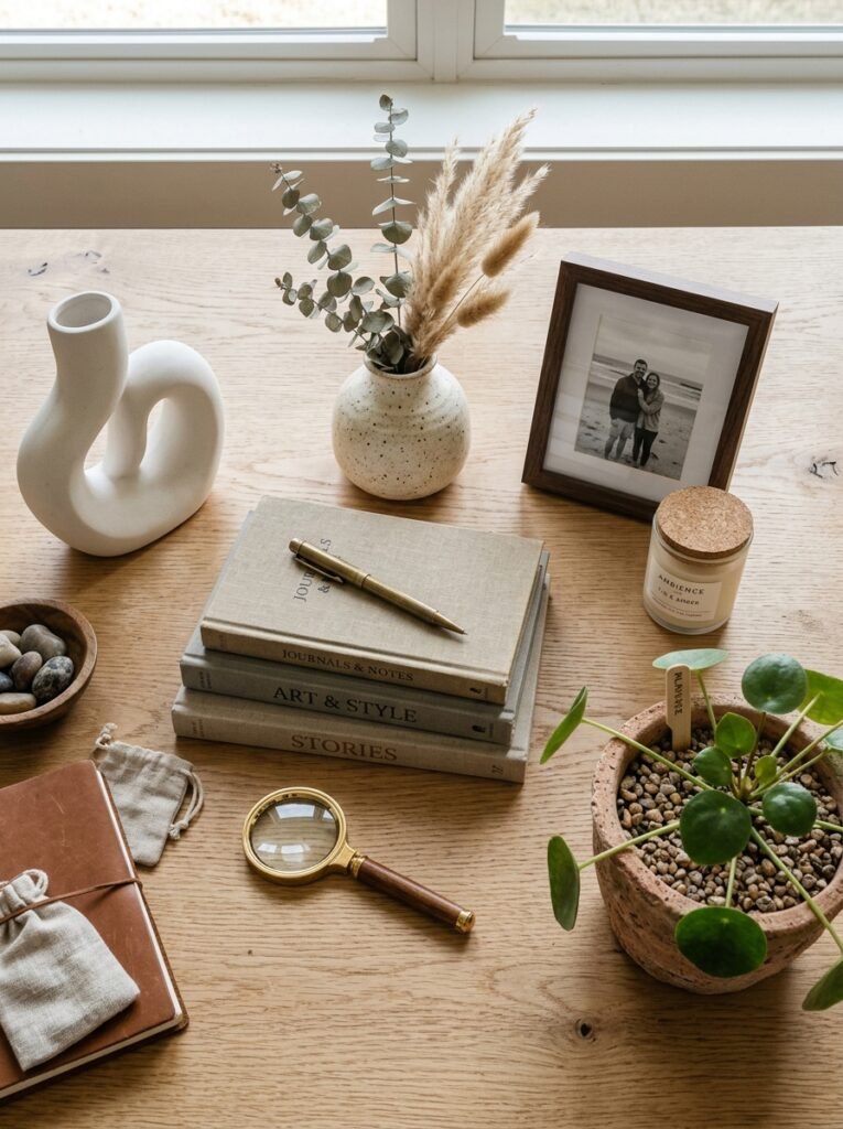
Thinking in shape families beats thinking in categories. A useful pool contains something vertical, something round, something low and horizontal, and something irregular. Four vases of similar proportion offer far less to work with than four objects that disagree with each other.
Gathering roughly half again as many candidates as the shelf can hold builds in the freedom to reject things. Styling improves in the rejecting, and a pool with no spare options forces every piece onto the shelf whether it earns a place or not.
Shelf depth quietly rules out a portion of the pool. A unit 20 centimetres deep cannot take a wide bowl without it hanging over the edge. Measuring once, before hauling objects in from other rooms, saves a second trip.
Work in Groups of Three
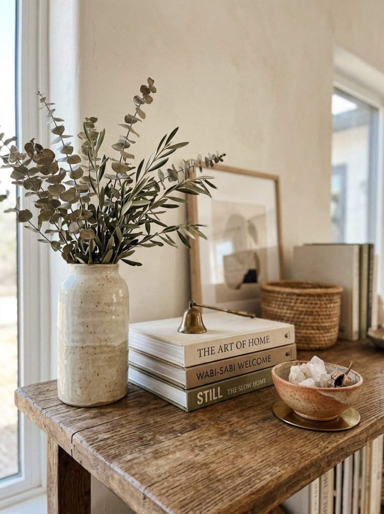
The reasoning behind odd numbers is more mechanical than mystical. Given an even set, the eye pairs objects off and stops moving. Given three, it has nowhere tidy to land and keeps travelling across the group.
The strongest trios form a triangle rather than a row. One tall piece sets the apex, a mid-height piece follows, and something low closes the sequence. That descending line gives the eye a direction to follow instead of three unrelated stops.
Long shelves complicate the rule. A run of two metres holds two or three separate trios far more comfortably than one sprawling arrangement. What makes each group readable is the gap between them, so the empty stretches deserve as much planning as the objects.
Use Books in Clever Ways
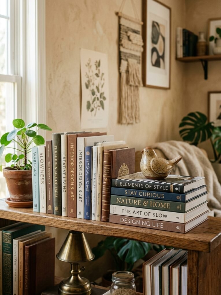
Books do double duty on a shelf. Upright, they supply a run of colour and vertical rhythm. Stacked flat, they become a plinth that raises a small object to a more useful height.
Short stacks hold up better than tall ones. Three to five volumes stay stable and read as deliberate, while a leaning tower of a dozen looks like storage that ran out of road. Sizing the stack so the largest book sits at the bottom keeps the edges clean.
Preservation guidance is worth heeding for anything valued. The Library of Congress advises keeping shelved books upright and unleaning, with bookends where needed, and storing oversized volumes flat and fully supported rather than wedged in at an angle. It also warns against resting a book spine-up, since gravity gradually pulls the text block away from the cover.
Turning spines inward produces a calm, uniform wall of paper, and plenty of people like the look. The cost is retrievability: nothing on that shelf can be identified without pulling it out, which tends to end the habit within a month.
Play With Height and Layers
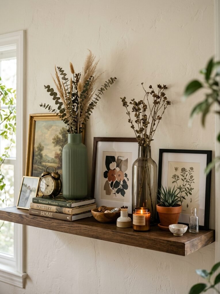
Height gets most of the attention, but depth is where amateur arrangements usually fall down. Objects tend to get pushed to the back wall, which wastes eight or ten centimetres and flattens the whole display into a single plane.
Bringing the front pieces right to the shelf edge fixes it. The gap that opens up behind them catches shadow, and shadow is what reads as depth. Leaning a frame against the back wall and setting something small in front of it uses the same principle.
Across a multi-shelf unit, the tall pieces need staggering. When the tallest object on every shelf lands in the same vertical column, the unit develops a stripe. Shifting each one left or right of the last breaks that pattern up.
Add Greenery for Life
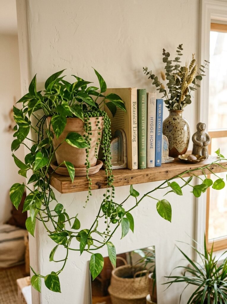
Trailing stems do something no other object on a shelf can manage. They break the horizontal line and soften the corner where a rigid unit meets the room.
Placement decides survival, though, and most shelving sits well away from a window. Species that tolerate low light, such as heartleaf philodendron or a cast iron plant, cope with those conditions. Sun-lovers parked in a dim corner decline slowly and take the display down with them.
Watering causes the practical headache. A pot with drainage sitting inside a waterproof cachepot allows the plant to be lifted out at the sink and returned, which protects the shelf from rings and rot. Dried grasses or preserved stems sidestep the issue entirely and hold their shape for years.
Leave Plenty of Breathing Space
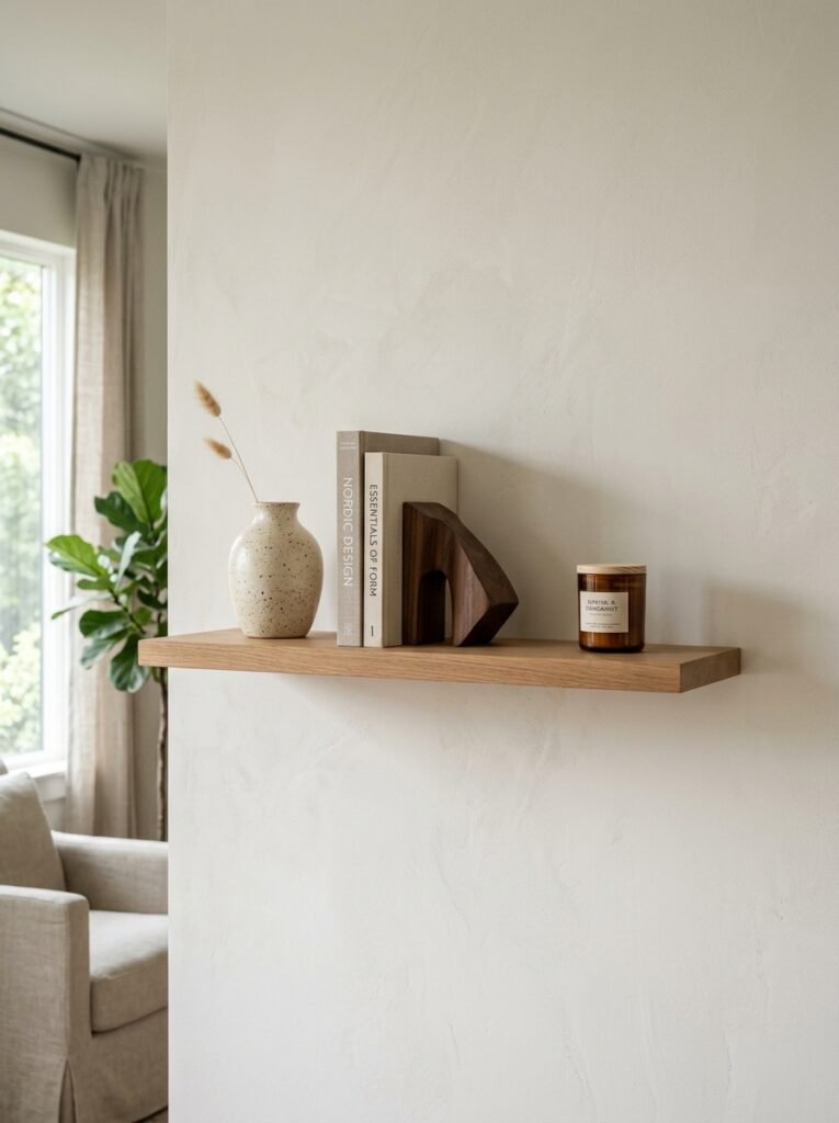
Filling around two thirds of a shelf and leaving the remaining third open is the usual working figure. The empty portion is not wasted space. It is what allows each object to register as a separate thing rather than part of a mass.
Vertical clearance gets overlooked more often than horizontal gaps. Objects that reach almost to the underside of the shelf above make the whole unit feel jammed, whatever the spacing along the row. Roughly a third of the shelf height left clear above the tallest piece keeps the compartment breathing.
The instinct to fill a gap is worth resisting. In a compact room the effect compounds, which is one reason open shelving appears in most guides to small changes that make a room feel bigger. Removing one object usually improves a crowded shelf faster than rearranging all of them.
Balance Without Being Symmetrical
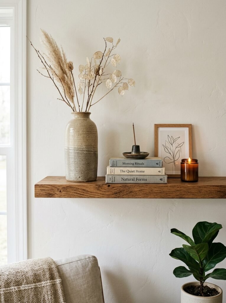
Visual weight has little to do with actual weight. Size contributes, but so do darkness, density, and pattern. A small charcoal ceramic can hold its own against a much larger pale one, which is why matching sizes side to side rarely produces balance.
The whole unit needs assessing as a grid, not one shelf at a time. Dark and dense objects belong lower down, where they read as a base. Concentrated at the top, the same pieces make the unit look ready to tip forward.
Squinting at the arrangement from a few paces back is the fastest diagnostic available. Detail drops away and the blocks of weight become obvious, which makes the heavy side easy to spot.
Mix Textures and Finishes
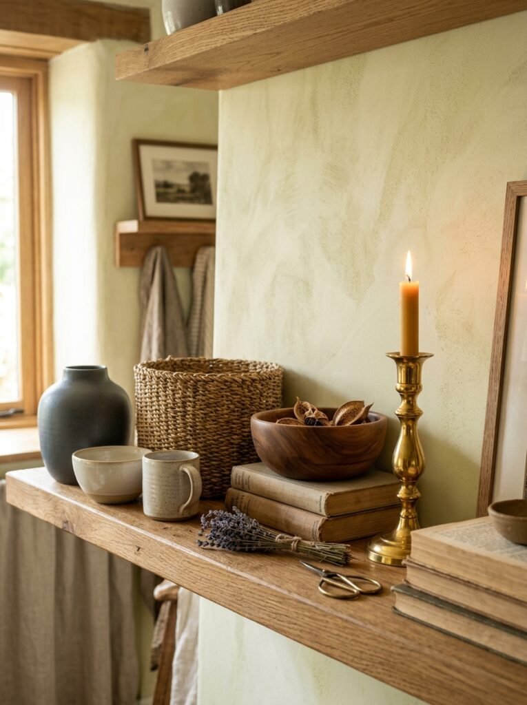
Finish controls how far forward an object appears to sit. Matte surfaces absorb light and settle back. Gloss and polished metal throw light forward and pull attention, which makes them effective in small doses and exhausting in large ones.
Metals reward restraint in particular. One or two finishes across a unit look considered, while brass, chrome, black steel, and copper competing on the same shelf look accidental.
Rough natural materials carry most of the warmth. Woven baskets, unglazed stoneware, raw timber, and linen-bound covers give a display something to feel as well as look at. Set against a smooth glazed vessel, that contrast does more work than any additional object could.
Personalize and Step Back
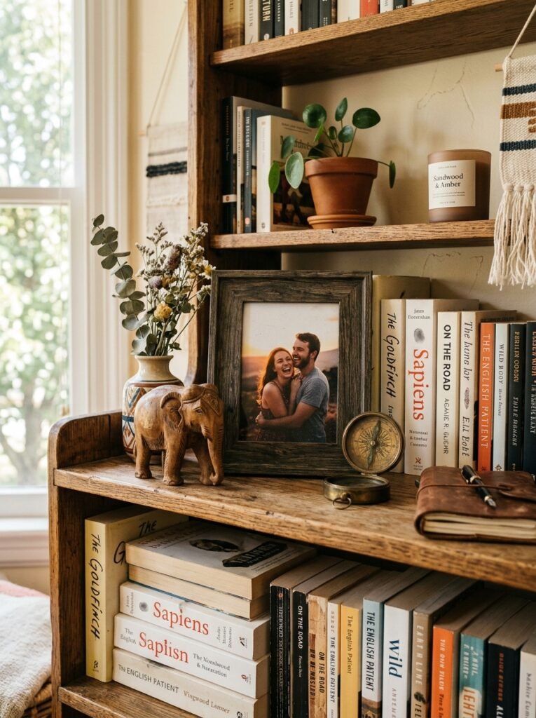
Personal objects work harder when grouped than when distributed. A souvenir, a photograph, and an inherited bowl sitting together read as a small collection with a reason behind it. The same three scattered across separate shelves read as leftovers.
Viewing position deserves a check before anything is called finished. A shelf gets seen from the doorway, from whichever seat faces it, and from close range while someone reaches for a book. The seated view usually matters most and is the one least often tested.
A phone camera is unexpectedly useful at this stage. Flattening the shelf into a two-dimensional image strips out the depth cues the eye compensates for, and any imbalance shows up immediately on the screen.
Final Thoughts

Every step here comes back to three variables: shape, spacing, and weight. Objects supply the shape, gaps supply the spacing, and colour and density supply the weight. A shelf that fails usually fails on one of the three, and identifying which one narrows the fix considerably.
Few arrangements land on the first attempt, and stylists rarely expect them to. Leaving a shelf overnight and looking again in daylight tends to expose whatever felt slightly wrong the evening before.
None of this requires a budget. The pieces sitting in cupboards around the house are almost always enough, once shape and spacing do the work that new purchases were supposed to.
Frequently Asked Questions
Where should the process begin? With an emptied shelf and a photograph of how it looked beforehand. Working around existing objects keeps the old arrangement in charge, and the before image settles later arguments about whether the new version is actually an improvement.
Why do groups of three work better than groups of two or four? Even-numbered sets invite the eye to pair objects off and stop. A trio arranged from tall to short forms a triangle instead, which keeps the eye moving across the group.
How much of a shelf should stay empty? Around a third, measured both along the shelf and above the tallest object. Vertical headroom gets forgotten most often, and a compartment packed to the underside of the shelf above looks crowded regardless of side spacing.
Is it necessary to buy anything? Rarely. Most homes already hold enough candidates once the search widens to other rooms. Shape variety matters more than newness, so a pool of mismatched existing objects beats a matched set bought together.
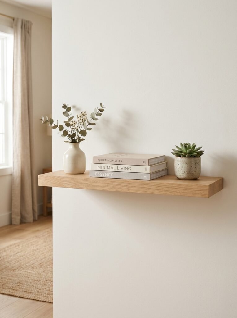
What is the quickest way to add height to a display? A short stack of books laid flat, with the largest volume on the bottom. It lifts a small object into view and adds a horizontal line among the uprights, without anything new entering the house.


One Comment