10 Small Changes That Make Any Room Feel Bigger
A cramped room is rarely a square-footage problem. Most of the time it is a sightline problem, a lighting problem, or a surfaces problem. All three respond to changes that cost little and take an afternoon.
The ten adjustments below work in rentals and owned homes alike. None of them require permission, permits, or a contractor. Several require nothing beyond a tape measure and a willingness to move furniture away from the walls.
What follows leans on specifics rather than general encouragement: rod heights, walkway widths, paint numbers, and the reasoning behind each. Anyone furnishing a compact home from scratch may also want this companion list of small home decorating ideas that make a big impact.
Let the Light Flood In
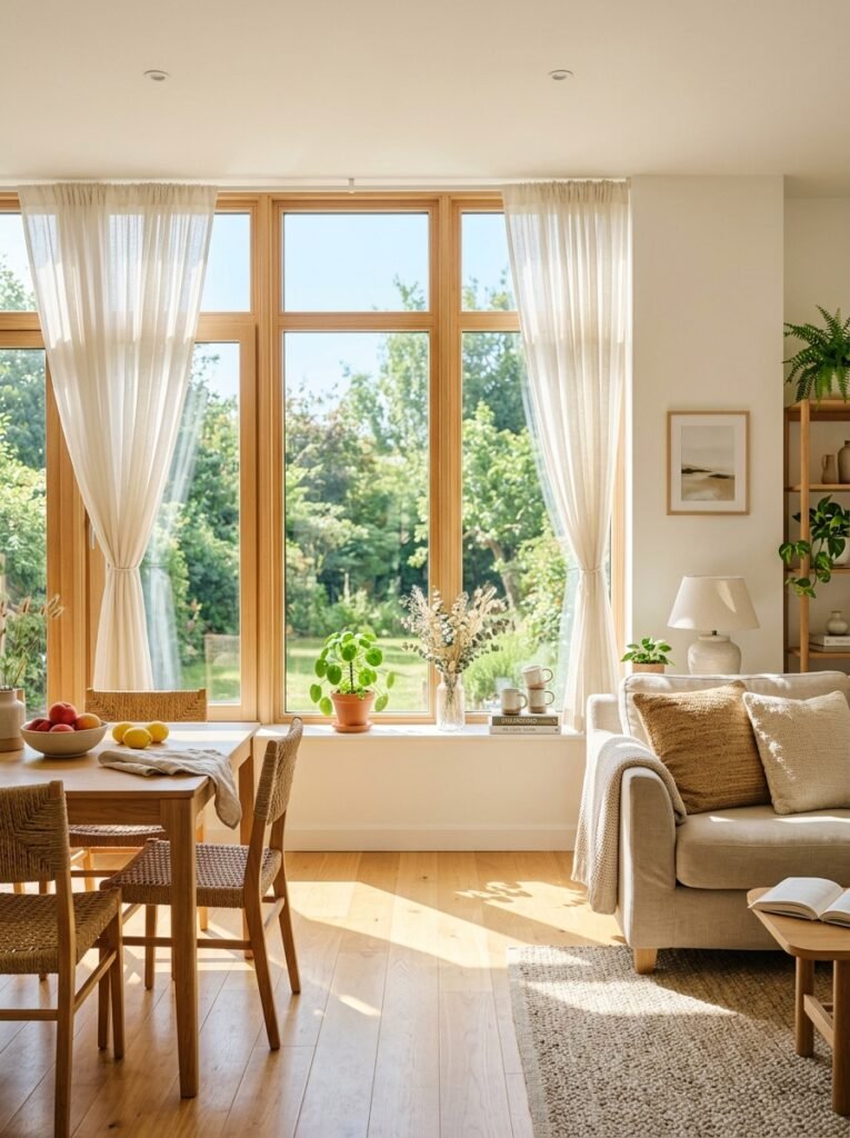
Daylight is the cheapest expansion available, and most rooms waste a surprising amount of it. The window itself is rarely the limit. What sits around the window usually is.
Roller and Roman blinds stack at the top of the glass even when fully raised, which quietly removes the brightest few inches of the opening. Mounting the blind above the frame instead of inside the recess returns that light. Tall furniture parked beside a window casts a shadow across the whole wall, so shifting it a metre along the room changes the feel of the space by mid-afternoon.
Surfaces near the glass matter too. A pale reveal, sill, and frame bounce daylight deeper into the room than dark timber does. Dust and grime on the panes cut transmission noticeably, which makes twice-yearly window cleaning one of the better returns on an hour of work.
Use Mirrors to Trick the Eye
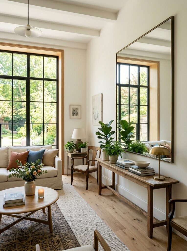
Mirrors get recommended constantly, and the advice usually stops at hanging one somewhere bright. The more useful question is what the mirror actually reflects, since that reflection becomes a second view of the room.
A mirror aimed at a doorway, a hallway, or a stretch of empty floor reads as distance. A mirror aimed at a cluttered console reads as twice the clutter. Standing in the doorway and checking the reflected view before drilling takes thirty seconds and prevents the second outcome.
Finish affects the result as well. Clear silvered glass returns the most light, while antiqued or foxed panels look handsome and reflect considerably less. Rooms that need brightness are better served by plain glass, with the decorative version saved for a spot that already has light to spare.
Stick to a Light Color Palette
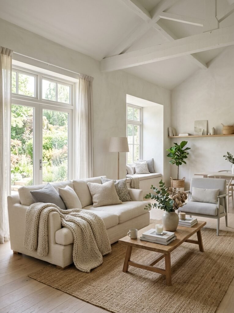
Paint charts carry a number that settles most of this debate. Light reflectance value, or LRV, runs from 0 for black to 100 for pure white. Shades above roughly 60 push light back into a room, and anything under about 30 absorbs a good deal of it.
Sheen contributes as well. A flat matte finish swallows light, while eggshell and satin return more of it without the glare of full gloss. Walls in a compact room generally do better in eggshell than in the fashionable dead-flat finishes.
One trick outperforms the colour choice itself. Painting the skirting, architraves, and door frames the same shade as the walls removes the contrast lines that mark where a room stops. Without those borders, the eye loses its measuring points and the walls read as further away.
Clear the Clutter First
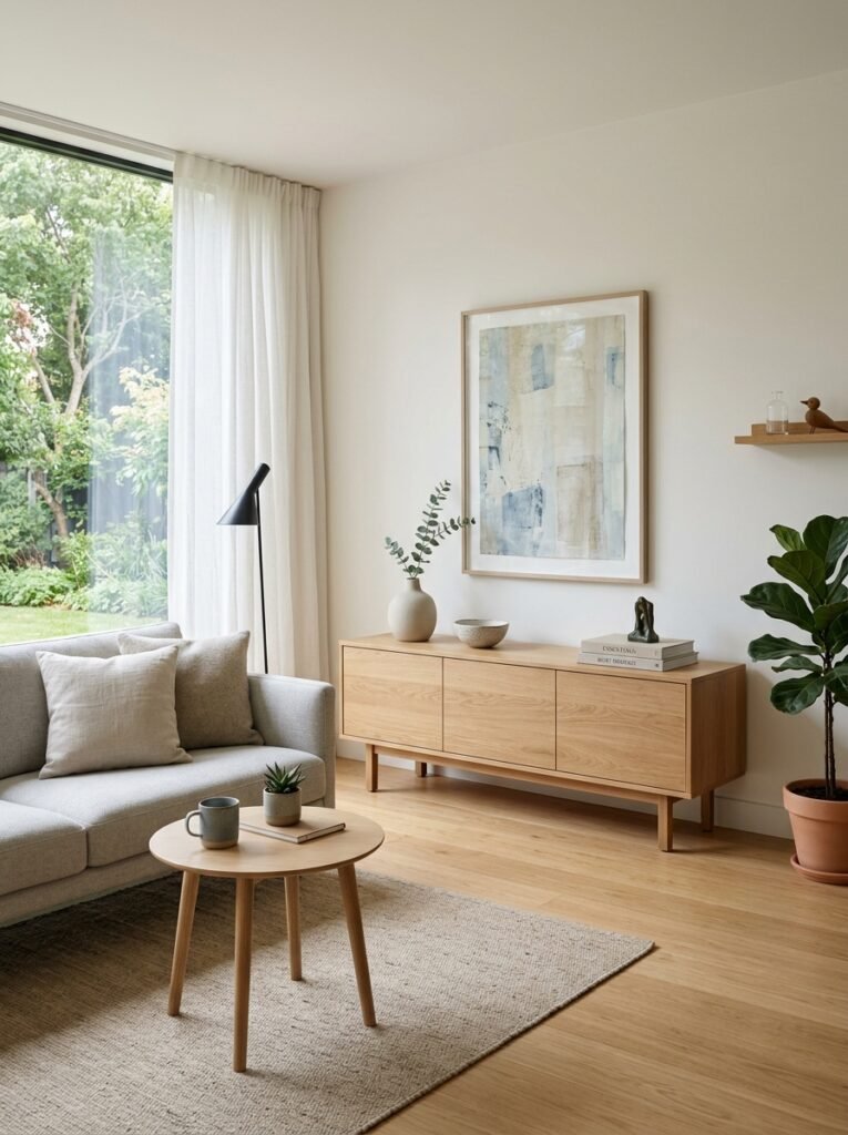
Horizontal surfaces collect first. Worktops, coffee tables, hall consoles, and the floor beside a sofa gather objects faster than any cupboard, and those are exactly the planes the eye uses to judge how much room is left.
Height matters more than volume here. A drawer packed to bursting costs nothing visually, while six items scattered at eye level cost a great deal. Sorting by what sits in the open, rather than by category, clears the visual load faster than a full-house purge.
There is measurable weight behind the advice. A study of dual-income couples published in Personality and Social Psychology Bulletin found that women who described their homes using more clutter-related language showed flatter daily cortisol patterns, a profile the researchers link to poorer stress recovery. The study reports a correlation rather than a cause, but it suggests the difference is not purely cosmetic.
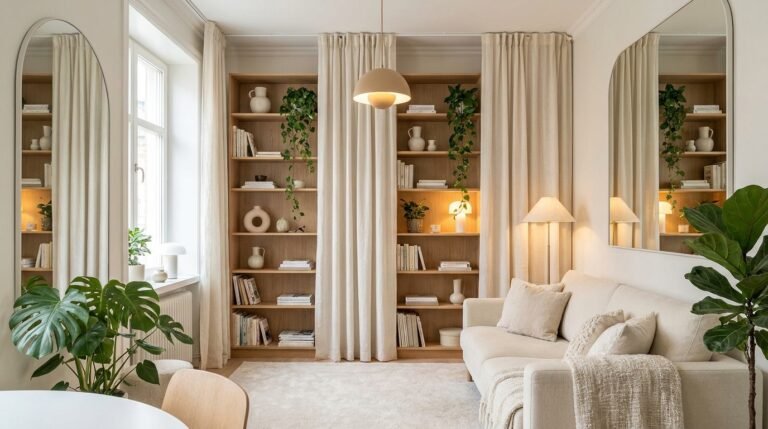
Lift Your Curtains Up High
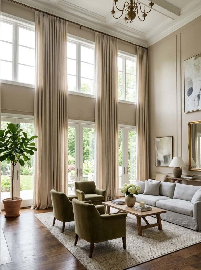
This adjustment has actual numbers behind it, which is why it works so reliably. The rod belongs roughly 10 to 15 centimetres below the ceiling, or halfway between the top of the window frame and the ceiling line where the gap is generous.
Width follows the same logic. Extending the rod 15 to 25 centimetres past each side of the frame gives the open panels somewhere to sit that is not the glass. That single change can uncover a third more window on a narrow opening.
Fabric quantity decides whether the effect looks deliberate. Panels need a combined width of about twice the rod length to hang in proper folds instead of stretching flat. Skimpy curtains read as an afterthought no matter how high the rod goes.
The hem finishes the job. Panels that stop at the sill cut the wall in half, while panels that reach the floor draw one unbroken vertical line from ceiling to skirting.
Choose Furniture With Legs
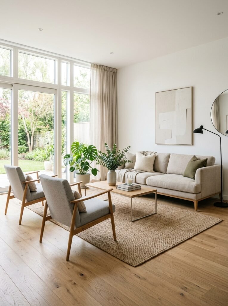
The principle is simple: every strip of visible floor makes the floor plane read as continuous. A sofa on raised legs lets that plane run underneath it. A skirted or plinth-based sofa stops it dead and behaves like a low wall.
Arms deserve equal attention, though they rarely get it. A slim track arm can save fifteen centimetres a side against a rolled arm, on the same seat width. Across a three-seater, that is close to a third of a cushion reclaimed from pure bulk.
Side tables and consoles follow the same rule. Open frames, glass tops, and slender metal legs allow the room to carry on behind them, which solid cabinetry cannot do.
Scale Your Furniture Properly
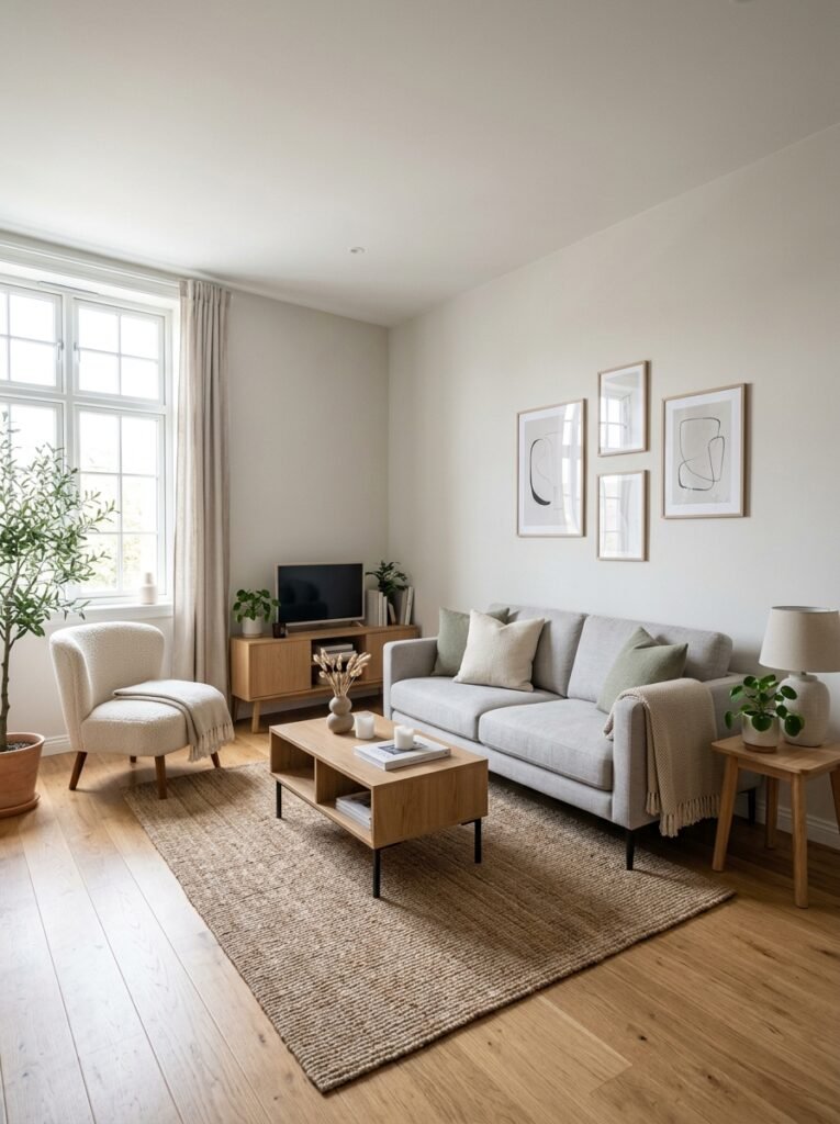
Width gets all the attention in showrooms, but depth and back height cause most of the trouble. A sofa 100 centimetres deep eats far more of a small room than one 85 centimetres deep, even where the two measure the same across.
Low backs help as well, since anything below eye level keeps the far wall visible from the doorway. Sightlines across a room do more for the sense of space than the actual footprint of the furniture.
Circulation needs protecting before anything gets ordered. Main routes through a room want roughly 90 centimetres of clear width, and about 40 centimetres between a sofa and a coffee table keeps things comfortable. Marking the intended footprint on the floor with painter’s tape settles the question before delivery day does.
Keep Flooring Consistent
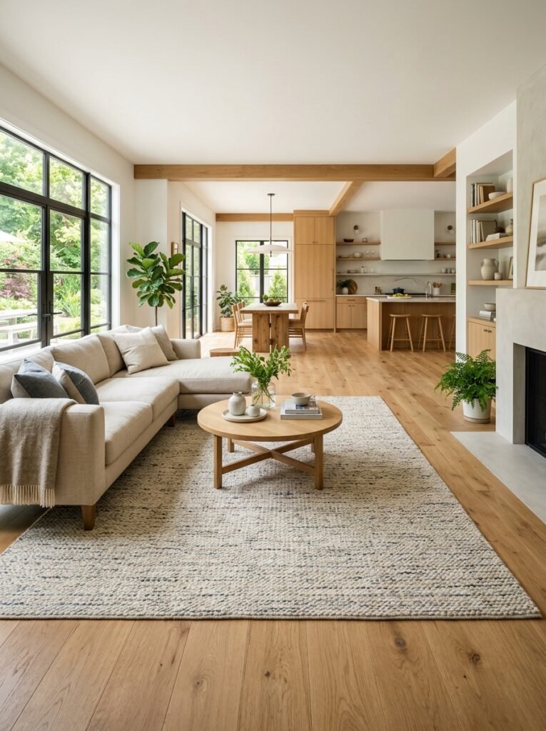
Floors carry more visual weight than walls because nothing interrupts them. Every change of material, colour, or direction acts as a boundary, and boundaries divide a space into smaller readable chunks.
Continuity between adjoining rooms produces the biggest gain. Running the same finish through a doorway, laying boards in one direction across both spaces, and removing threshold strips where the levels allow all stretch the apparent distance.
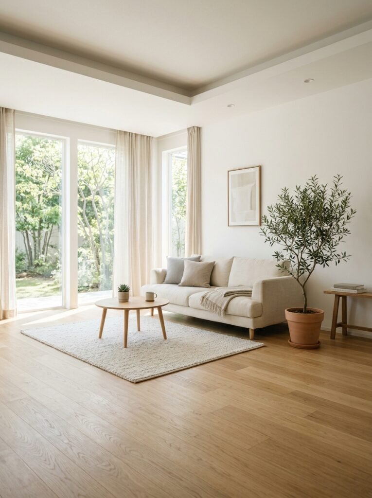
Rugs still earn their place, provided they are generous. A rug sized close to the walls reads as flooring and disappears into the plane. A small mat floating in the centre reads as an object, and objects on the floor make the floor look shorter.
Go Vertical With Storage

Going up frees the floor, but the choice between open and closed storage decides whether the room actually calms down. Open shelves display everything on them, including the things nobody wants on display. Doors turn the same unit into a quiet plane.
Colour does the rest of the work. Painting a bookcase or run of shelving the same shade as the wall behind it makes the unit recede rather than announce itself. Contrasting joinery has the opposite effect and measures the room out in blocks.
Wall-mounted units beat floor-standing ones where the wall can take the load, since the visible floor beneath them keeps the plane running. Whatever stays on open display benefits from a considered arrangement, and this guide to styling a shelf like an interior designer covers that side properly.
Edit Your Decor Down
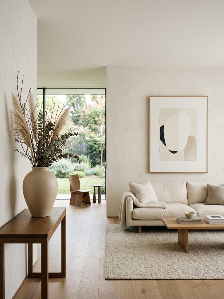
Editing is less about owning fewer things than about reducing the number of separate shapes competing for attention. Ten objects on a tray register as one item. The same ten spread across a table register as ten.
Wall art follows the same arithmetic. One large piece on a wall holds together, while a scatter of small frames breaks the wall into fragments and shrinks it. Where a group is unavoidable, matching frames and consistent gaps let the arrangement read as a single block.
Rotation solves the rest without anything leaving the house. Boxing up half the decorative pieces and swapping them in a few months keeps the room feeling fresh, and nothing gets sacrificed in the process.
Final Thoughts
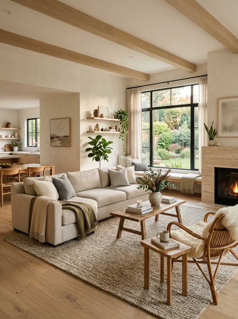
Nearly every item on this list works by removing a visual boundary. Trim painted out, floors running through, furniture lifted off the ground, surfaces cleared to a single plane. The room does not grow, but the eye stops finding edges to stop at.
Sequence makes the work easier. Clearing surfaces comes first, because it costs nothing and reveals what the room actually looks like underneath. Rehanging curtains comes next, since it takes an hour and changes proportions immediately. Furniture decisions belong last, once the room has been seen properly.
Renters lose very little here. Curtain rods, mirrors, rugs, storage, and editing all travel to the next address, and most landlords accept a repainted wall returned to its original shade.
Frequently Asked Questions
Which change delivers the fastest result? Clearing the horizontal surfaces at eye level and above. It costs nothing, takes under an hour in most rooms, and removes the visual noise that every other change has to work around.
Where should a mirror hang to make a room feel bigger? Somewhere that reflects depth rather than a wall. A doorway, a run of empty floor, or a window all work. Checking the reflected view from the room’s entrance before fixing anything avoids the common mistake.
Which paint colours open a room up? Anything with a light reflectance value above roughly 60, which covers most soft whites, chalky creams, and pale greys. Extending that shade onto the skirting and door frames does more than the colour alone.
How much clearance should furniture leave? Around 90 centimetres for main routes through a room, and roughly 40 centimetres between seating and a coffee table. Sofa depth and back height matter more than overall width in tight spaces.
Do these ideas suit rented homes? Nearly all of them. Only the paintwork needs a landlord conversation, and even that is usually reversible. Curtain heights, mirror placement, furniture scale, and editing carry no permanence at all.